
Vinyl Vision is a leading supplier of vinyl door and window trim, serving the supply needs of builders and contractors across the country. Instead of continuously providing an ever-changing swatch booklet to the abundance of contractors they supply, the 'Color Selector' app is intended to solve the problem by offering a simple tool enabling agents in the field to quickly match the color of existing trim to that of replacement options currently offered by vendors.
Long-established design firm 530 Media Lab thankfully gave me my first crack at mobile app design for a their client, so I did my best to ensure the final product was intuitive, effective, and easy to use. The direction was to model our prototype after the widely popular 'Swatches' application, so the functionality dissection began...
Key app functions that stakeholders sought to emulate were the user's ability to capture on-screen color, compare that to the exiting color wheel of vendor colors available to Vinyl Vision, to make any selection, store the pair, then easily email or text the matched color code. As wonderful as this reference app is, there was no need or budget available to include the full swath of functionalities, such as identifying general color codes like Hex, RGB, or the palette creator for example.
Graphic at left is used to summarize functionality, present iconography, and showcase user flow offered by the Swatches app; in efforts to determine what aspects will carry over to the Color Selector.
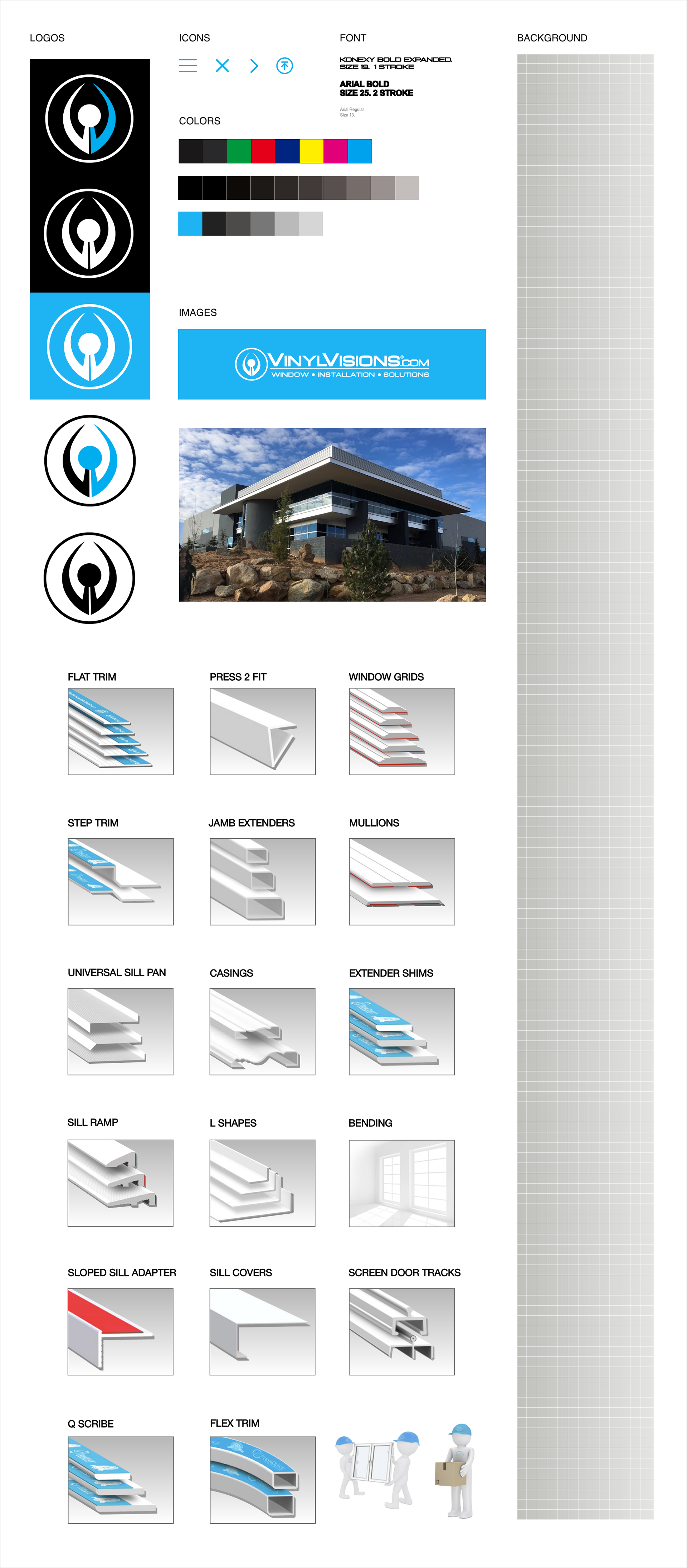
The next step was to nail down the number of available colors, along with the vendors that supply them. Scouring the web for high resolution logos and appropriate icons was the initial focus. Although vendor logos and icons were provided by 530 Media Lab, they needed to be re-sourced to produce a higher fidelity prototype. Additional efforts included recreating the Vinyl Vision logo from scratch. This reference pasteboard evolved into what would be considered a style guide, and includes a screen shot of the existing web-version of the color guide, displaying all supported brands.
Moving into XD, I first sought to draft various versions of the color guide/supported brands page, into a mobile view. At this early stage in the design process, I wanted to experiment with a few different schemes. (throwing around a dark-mode style option amongst others) to provide a variety of layouts for the client to choose from.
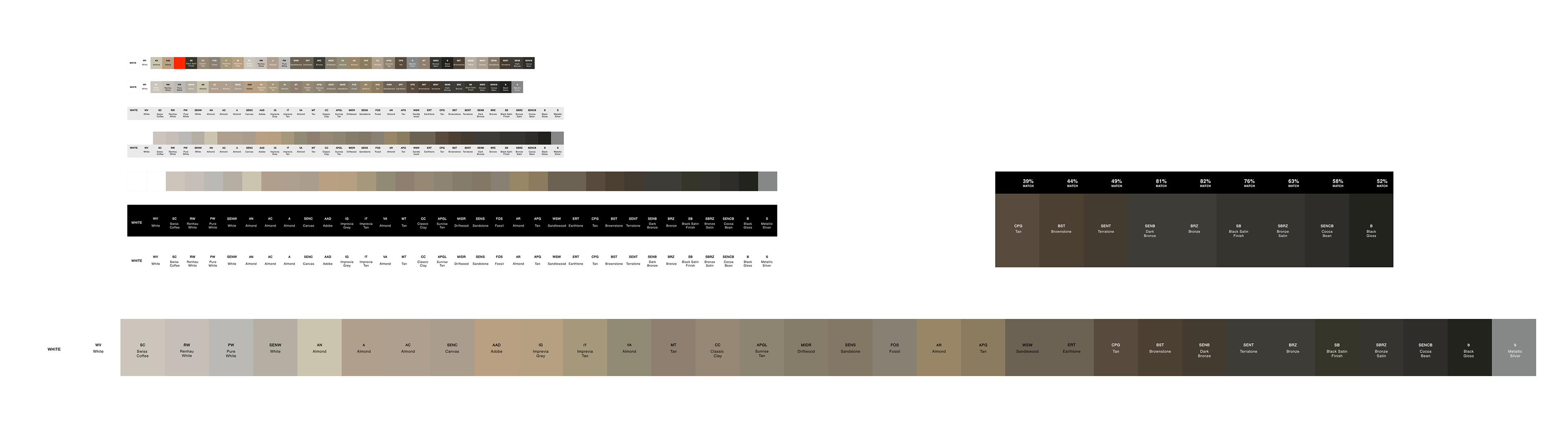
The official color guide assumed a particular sequence, irrespective of alphabetical color code, nor hue. I designed around the predesignated order of colors, so as not to throw a wrench in the works. My personal preference was to re-sequence the color guide for logical clarity, (either alphabetically or from light to dark) but evidently this was not possible to code per our development budget.
The swatches were provided, but in the organizational phase I determined there was a missing color way (hence the red swatch used as a place holder).
Ultimately, we went with the longest screen orientation (center), to display the largest swatch/logo on-screen, coupled with a horizontal scroll through brand names; The resulting screen was far less cluttered. Back to top button was crucial!
This phase called for vendor logo re-treatments in Ps, into both greyscale and B&W versions.
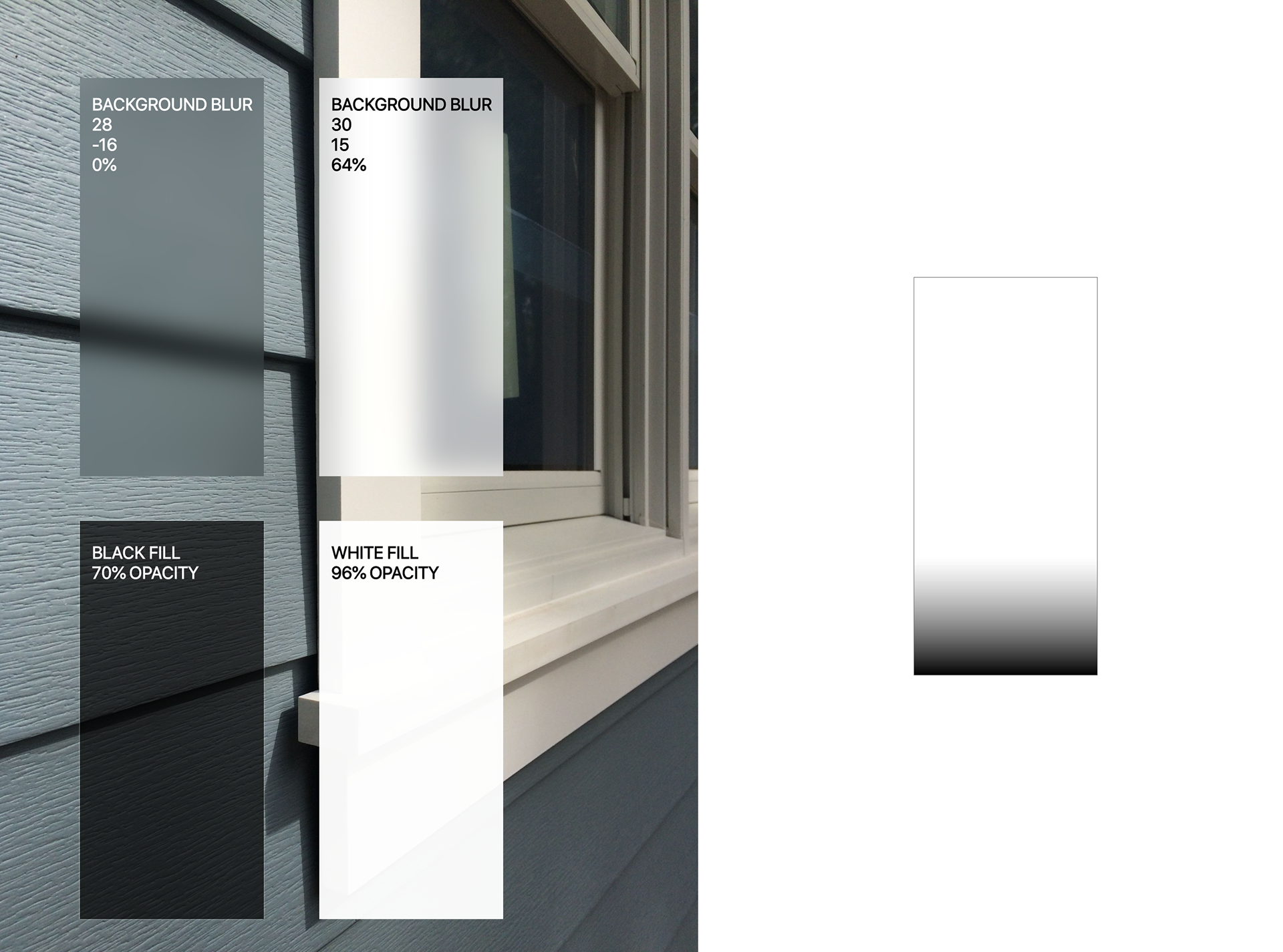
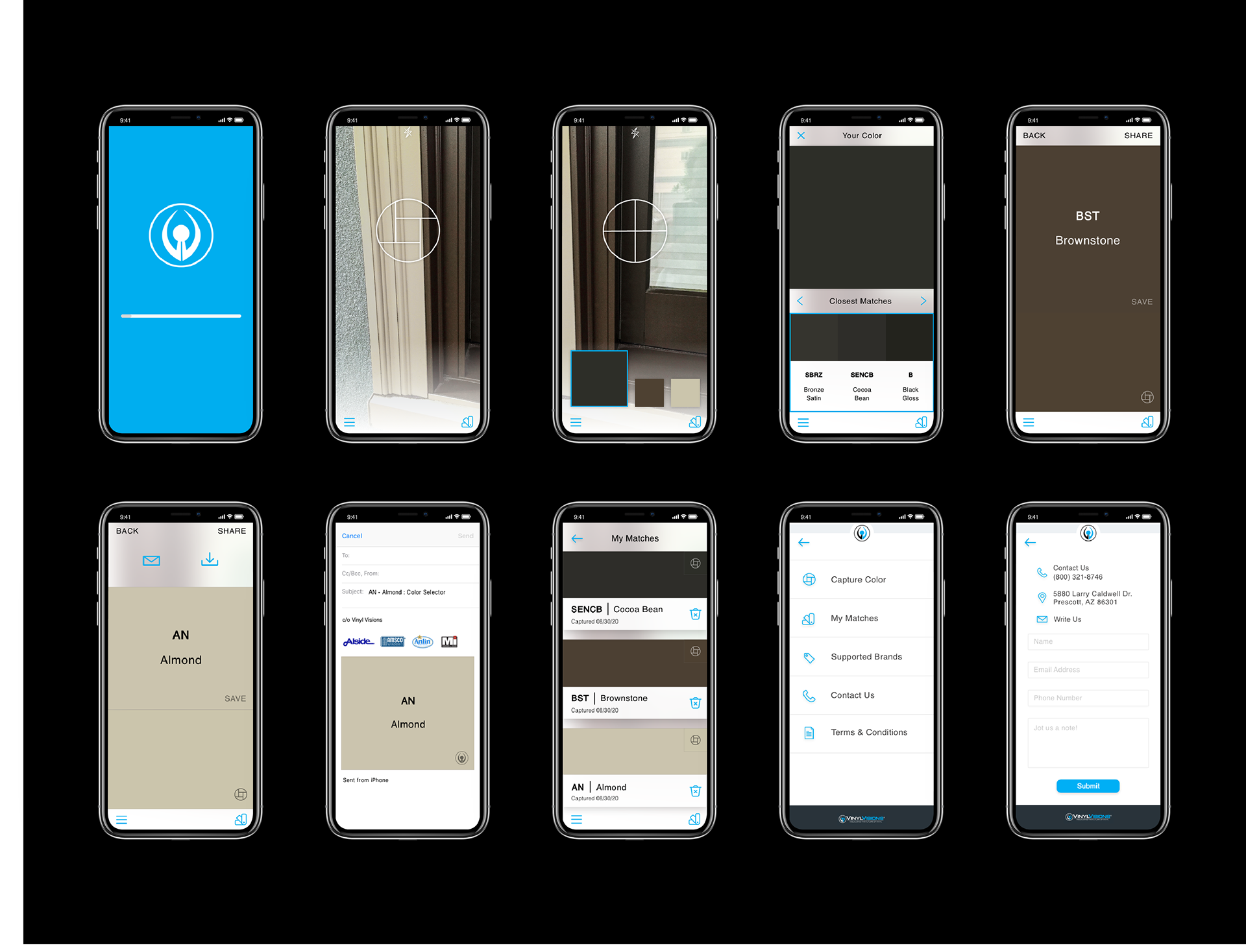
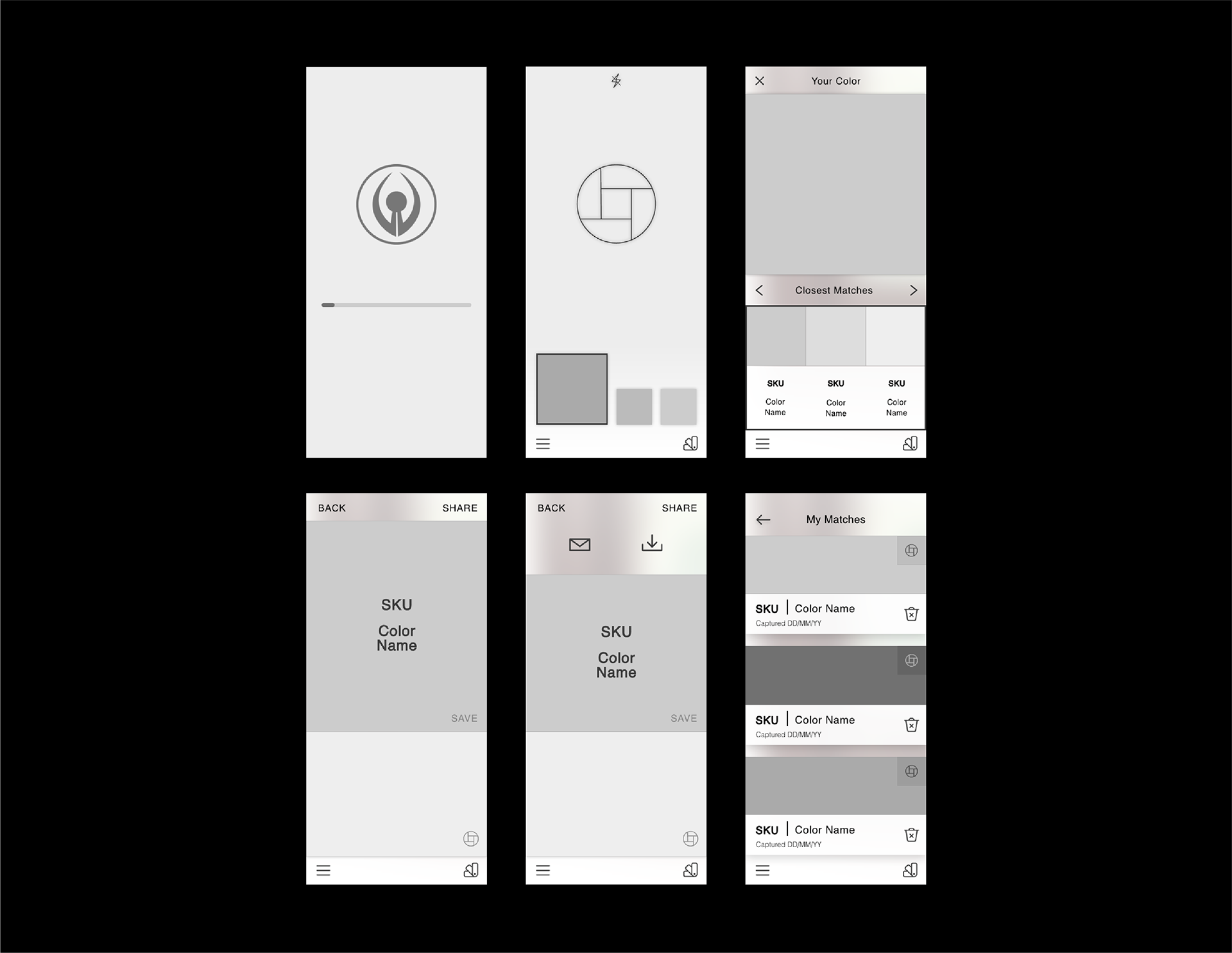
With vendor logos and available colors set straight, the move was to design capture color and comparison screens. This meant it was time to convince stakeholders that I needed to reorganize colors for hue, in a progression from light to dark as the user scrolls left to right.
Additional concern swirled around where to list the color code (on-top-of, or below the swatch), which certainly affects the font color (whether being black text on a lighter colored swatch, versus white text on a darker colored swatch).
The text color inconsistency was killing me! So the move was a separation.
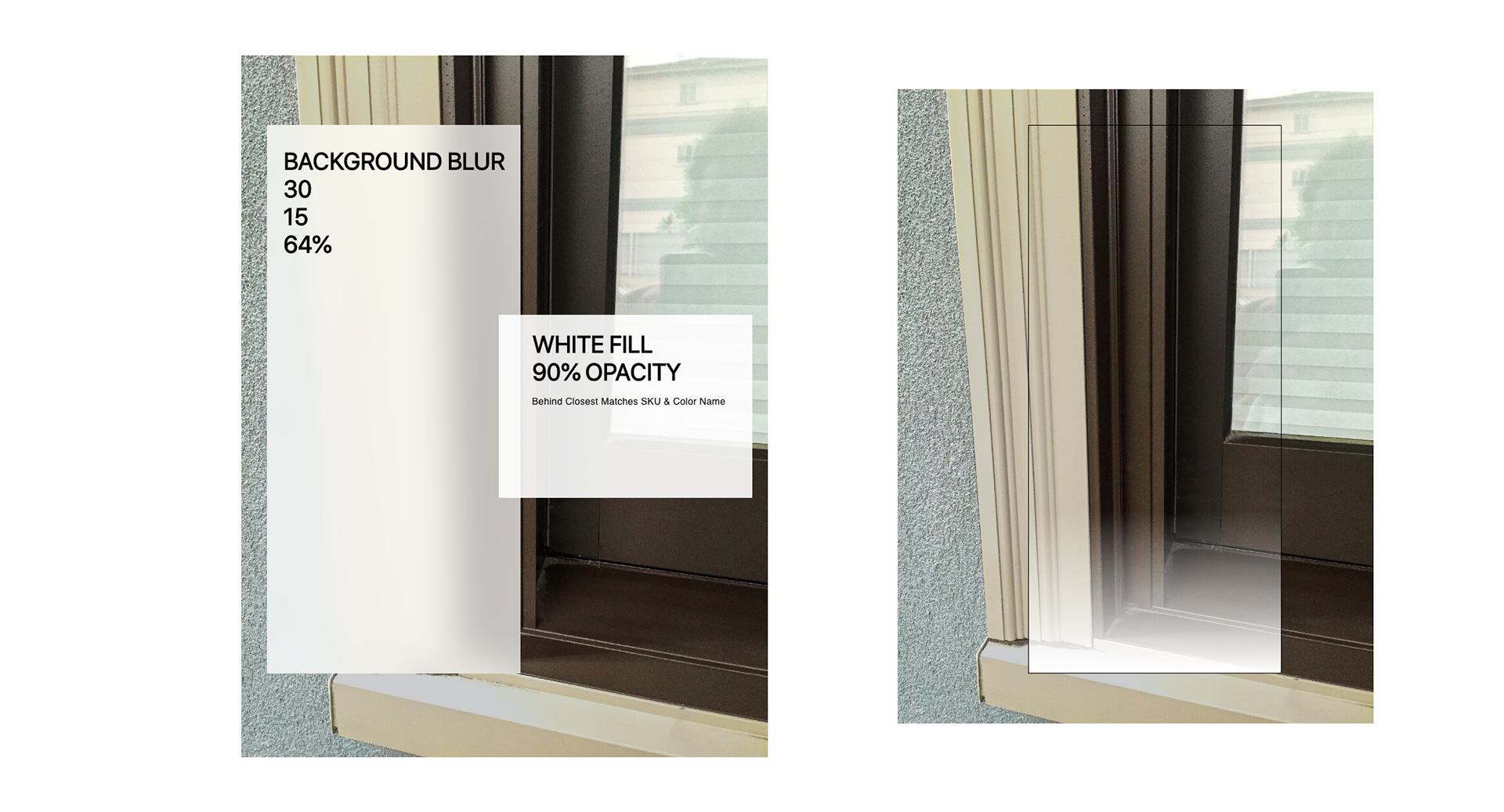
Getting into User Interface, the capture color screen was not drastically reiterated from mid-fi to finals, but the background image had to be repeatedly replaced for accuracy
Originally sourced image at bottom left was not actually vinyl window trim. Photo taken by me at bottom right, showing actual vinyl window trim, eventually retouched for color to match.
Other UI considerations involved applying various overlays to increase contrast for text, icons, and swatches.
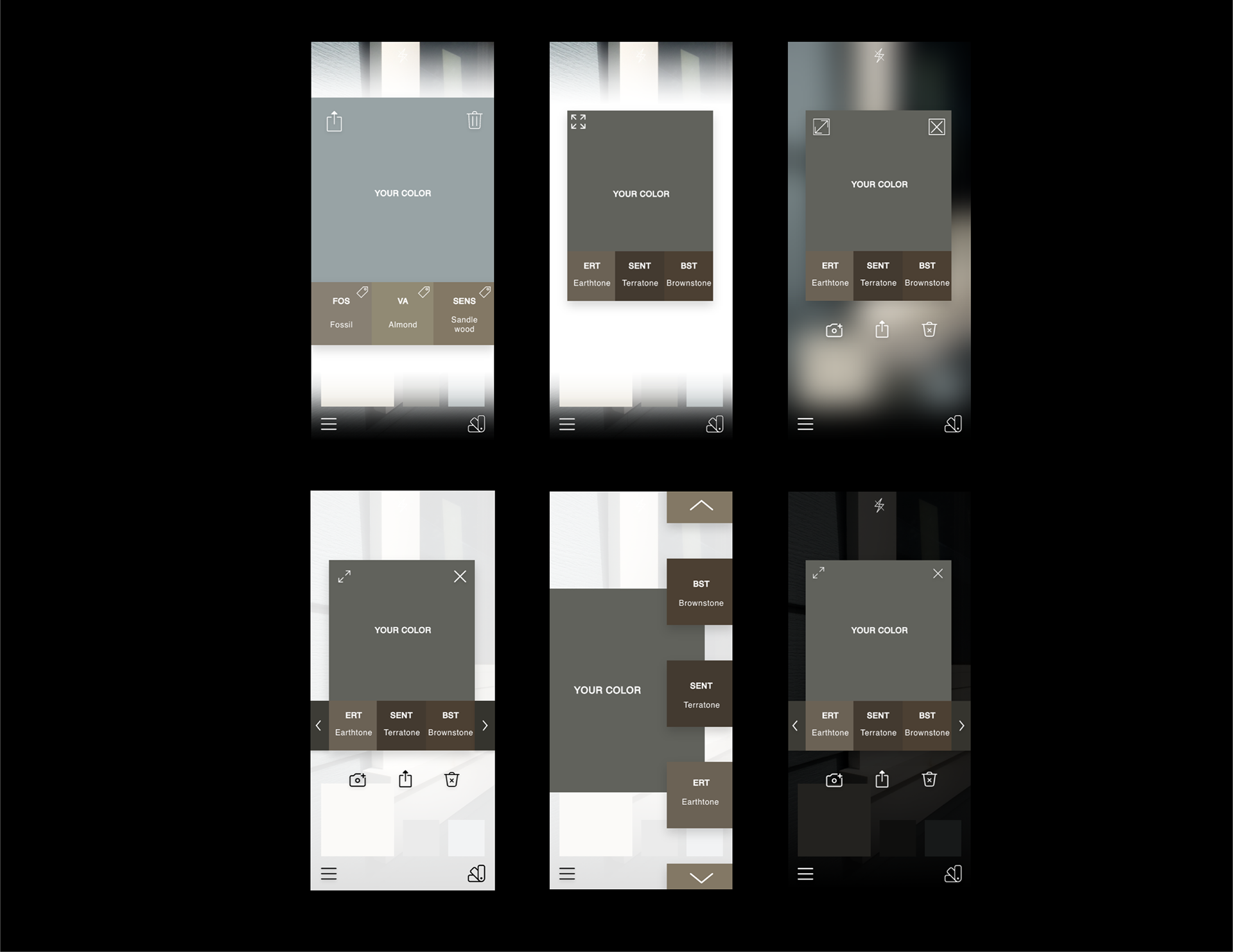
Progressing into color comparison screens, multiple layout options came to mind experimenting with various icon assortments, placement options, and screen orientations.
This is where the user will choose between captured color, and available matches offered by vendors.
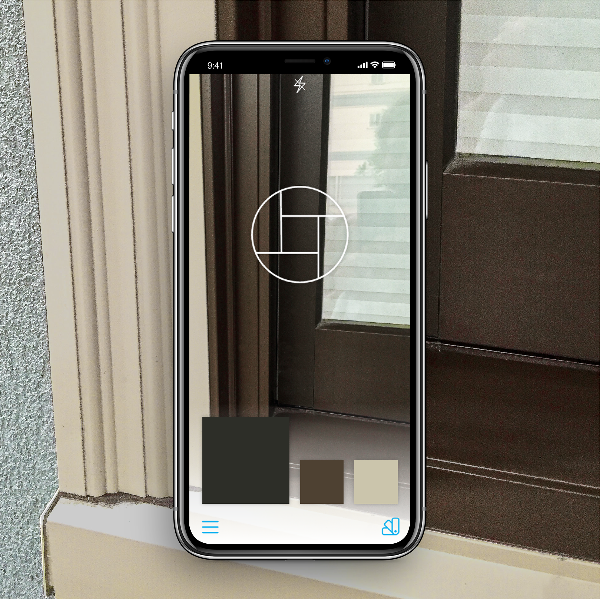
Enough on process, time to present some final frames and a demo video below.
Let me know what you think!
PHASE 2 - PROFILE SELECTOR
To launch phase two of our Vinyl Visions contract, we are poised with the challenge of creating a 'Profile Selector', as a mobile app reference guide. Again for contractors in the field, the Profile Selector is traditionally printed into a comprehensive pamphlet, annually, and at great expense.
The goal was to re-create this reference guide, containing an intimidatingly complex product array; preventing the need to print and distribute any physical booklet.

In order to wrap my head around this very large product assortment, and begin to organize user access into a comprehensive flow, the move was to absorb all provided assets.
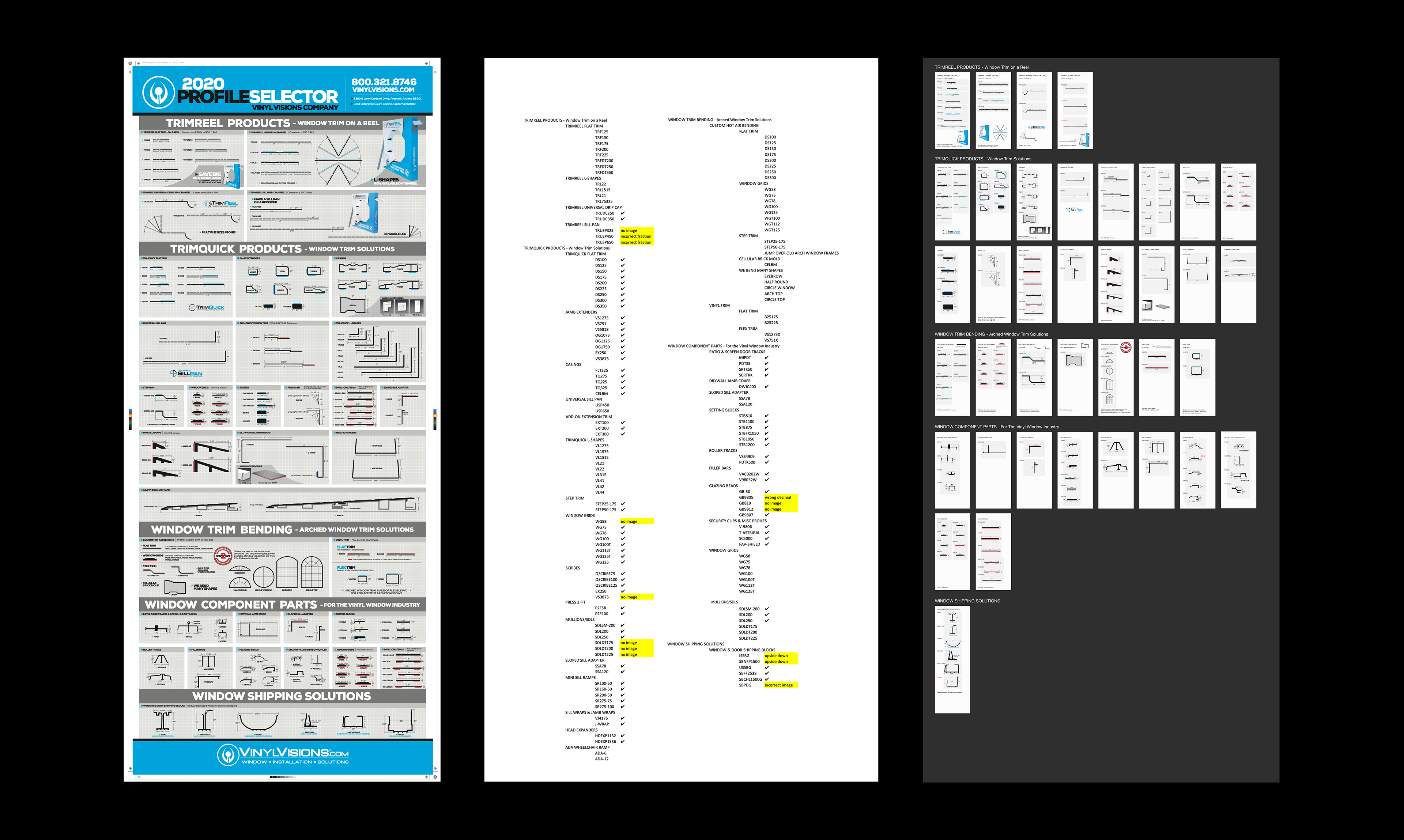
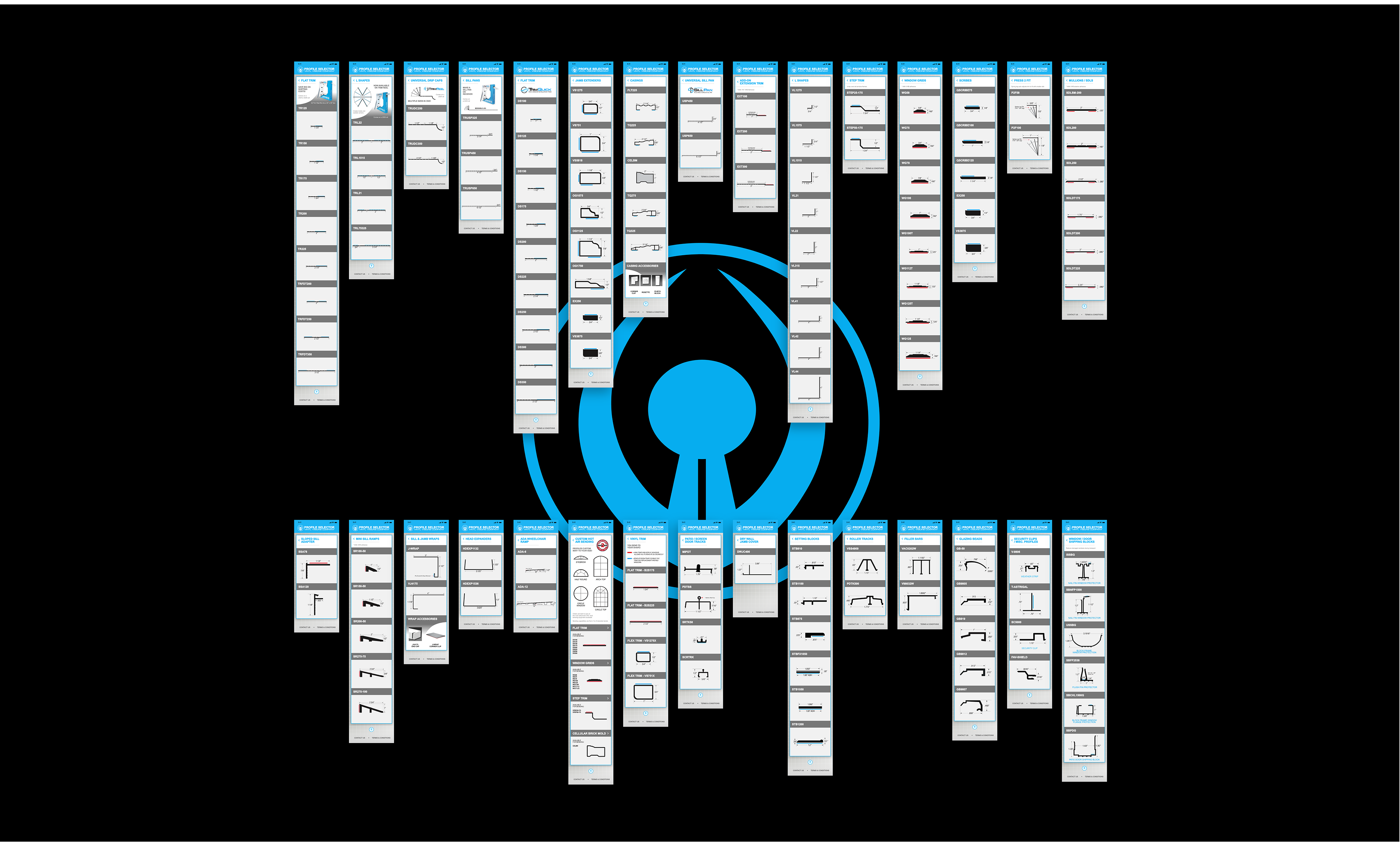
530 Media Lab provided a 2020 Profile Selector .pdf (below left), along with product images .jpgs, however pixelated. After assessing, I worked to create a simple .csv to organize products to determine missing or incorrect asset files. This resulted in level 1 - 4 view (below center).
Finally, we segmented the products into 5 categories, and pulled individual vectors out of the layered .pdf, moving into a detailed asset inventory (bottom right). This contained every last detail that was to be included in our digital reference guide.
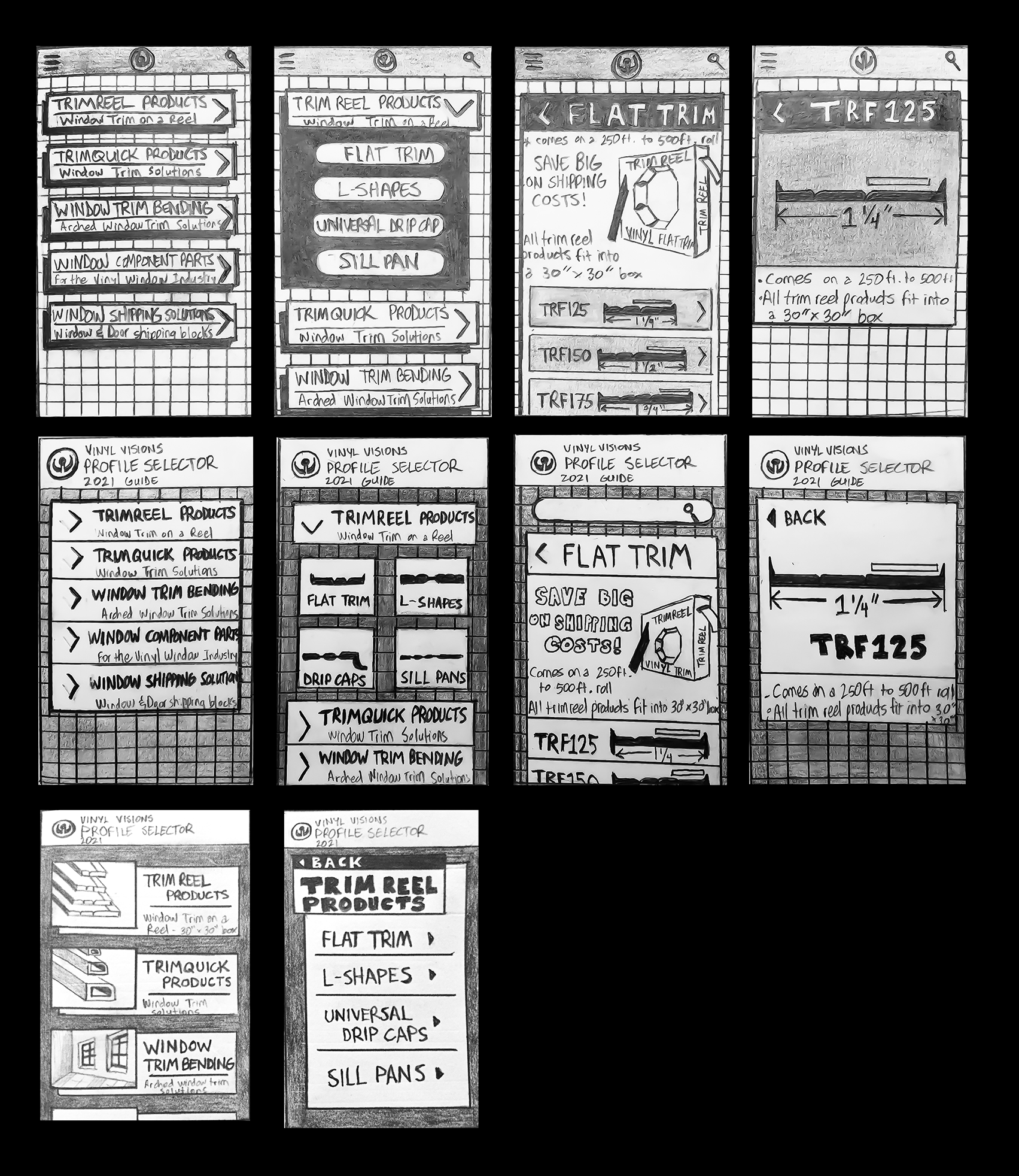
After taking stock of available products for indexing, next was to design layout options. Beginning with paper prototypes was crucial for layout approval before going digital with XD.
Rather than keeping product images on level 3 and 4. I sought to include them on level 1 for a less text-heavy home menu. Ultimately this was agreed upon by all stakeholders involved.
Knowing the client wanted to stick to a simplistic menu/drawer system (with no eComm option), I toiled with how to make this interface visually stimulating without losing sense of purpose.
Layout style/ease-of-use being our main concern, I worked to propose a few options for the home screen menu.
A dark mode, staggered image/container option was my preference (bottom middle). But ultimately the client decided to run with the first option, ditching the overlapping containers for the sake of reducing development pains.
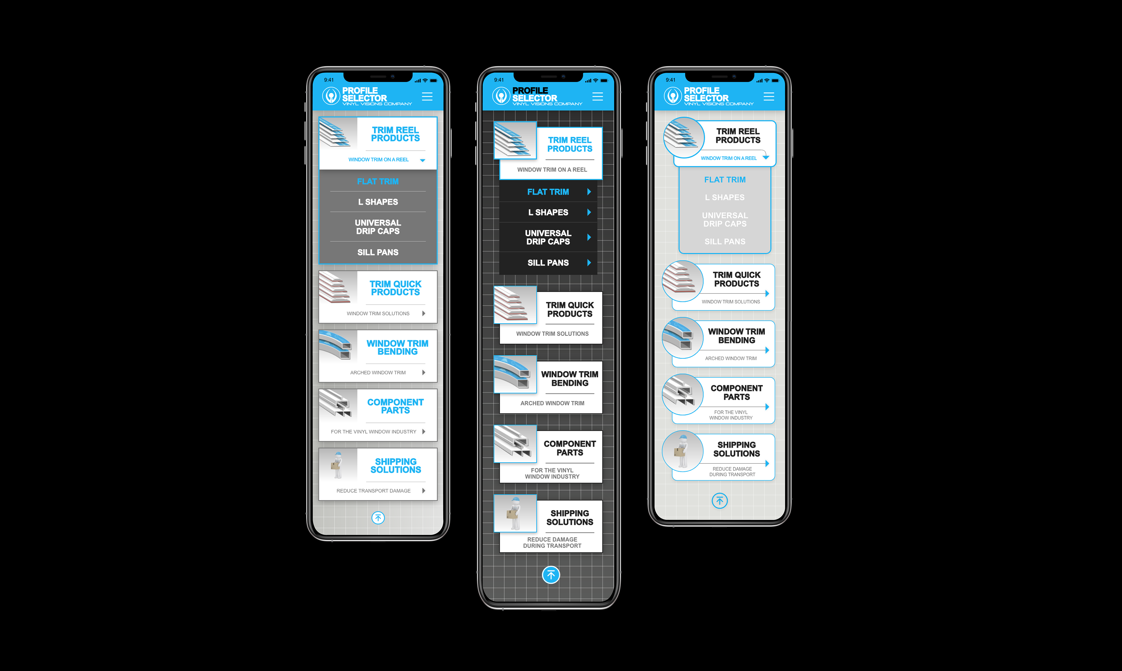
After a theme was designated, I was able to finally design product pages. At this point a discussion began about the need for a hamburger menu, being that it only contained 5 product categories found on home screen menu, along with Contact and T&C.
For added simplicity, the icon and menu was nixed entirely. VV logo then centered at header and necessary links included in footer of each page.
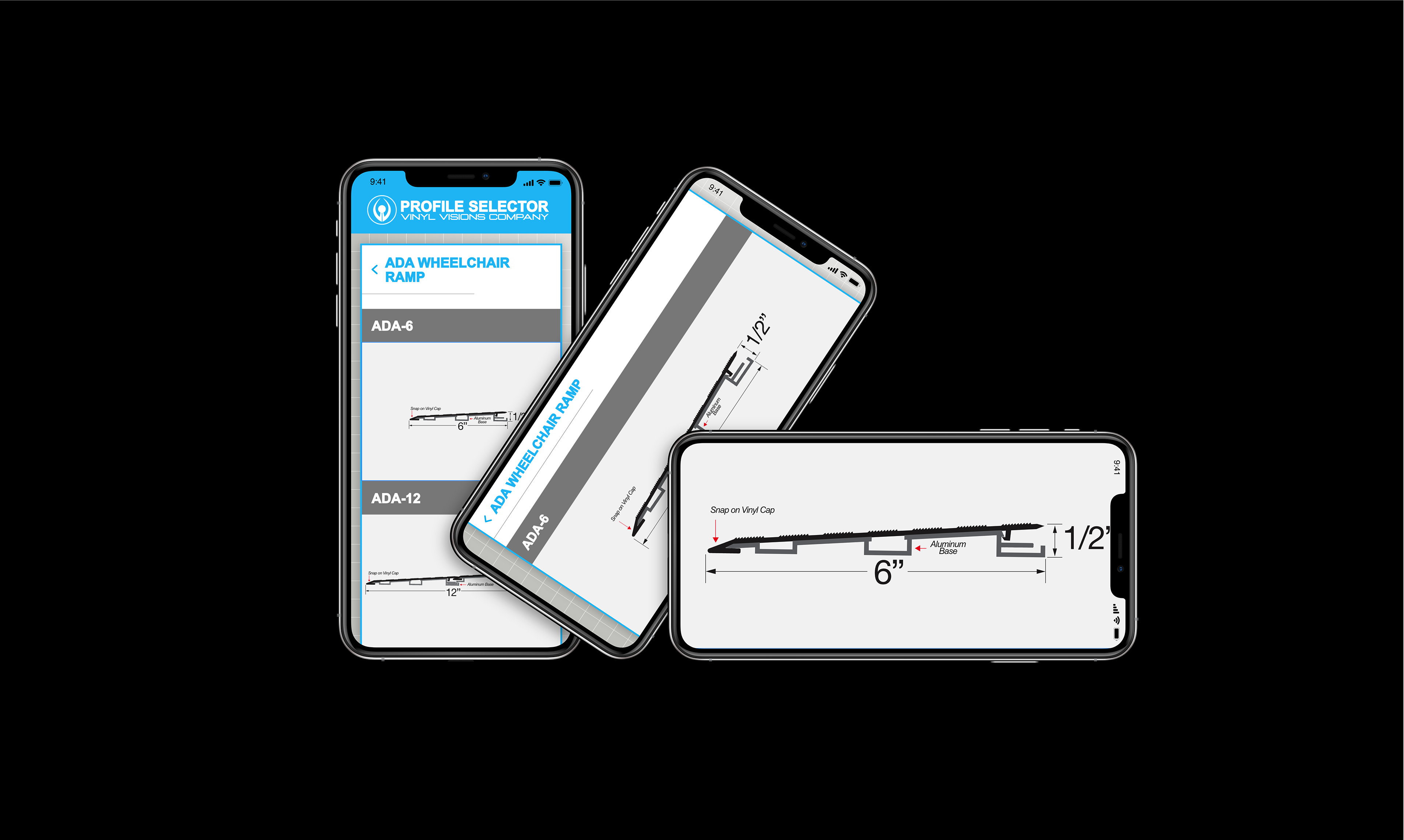
Ability to flip orientation and pitch to zoom on any product detail screen is exemplified.
STYLE GUIDE
FINAL SCREENS